
Project Details
Awards & Nominations
ForensX has received the following awards and nominations. Way to go!
The Challenge | From Curious Minds Come Helping Hands
Famine Risk Index (FRI) Early Detection System
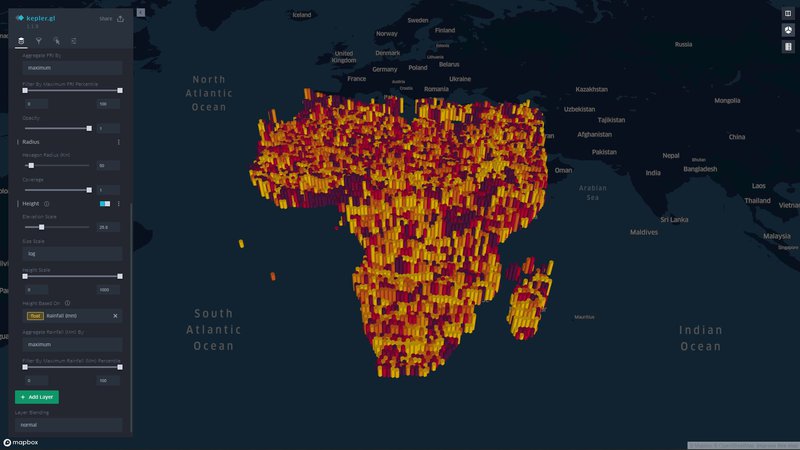
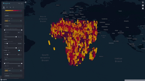
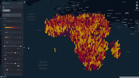
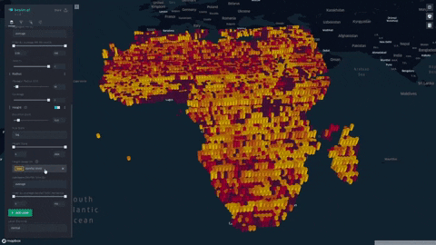
We formulate and visualize a custom famine risk index (FRI) as a consequence of drought for identifying populations at a high risk of famine in Africa. FRI takes into account local vegetation abundance, local population density, and local precipitation.
Checkout:
FRI Interactive Visualization (Live) (click on section dropdowns to expand interactivity tabs)
Background:
We chose to focus on famine, specifically in Africa, to address the environmental hazards that lead to vulnerabilities among populations. In doing so, we identify areas that require the most assistance, which can often be regions that are overlooked by humanitarian efforts.
Chronic malnutrition is a widespread problem in Africa, caused by drought, extreme weather, and economic disparities. 41 million people in Southern Africa fall under “food insecure” and 9 million people in the region require immediate food assistance. Unfortunately, the hunger crisis is only predicted to get worse as food security is deteriorating.
The motivation behind this project lies in humanitarian aid. We look to use this project to help get aid to those who need it quickly by visualizing populations at the highest risk of famine.
Problem:
The UN publishes a global hunger index (GHI) which considers multiple mortality and nourishment factors, but neglects environment hazards. Data sources are also withheld and are limited. No current model adequately incorporates environmental hazards with identifying at-risk populations.
Solution:
Given that there are currently no indices available which take into consideration both environmental and sociological factors when determining famine, we propose our own index, the Famine Risk Index (FRI), and visualize our FRI on a geospatial map. We look to serve this model as a proxy for studying and identifying at-risk populations with a focus on the consequence of drought and low agricultural productivity.
Main Features of the Famine Risk Index (FRI) Early Detection System:
- Ease of Use and Easy Analysis
- Our index is displayed on a progressive color scale, allowing scientists and researchers to easily identify the spectrum of famine across various regions.
- Interactivity
- Researchers using our project can use filters to aid and refine their search.
- Researchers can:
- Aggregate per population sizes by using our radius slider
- Specify percentiles to only show specific populations
- Change height overlays to visualize other environmental factors such as rainfall, soil moisture, and vegetation
- Aggregate per population sizes by using our radius slider
Future Extensions:
- We look to improve on the original concept of FRI by using statistical tests to study historical environmental and demographic data to previously recorded famines. Temporal modeling will be considered to take into account seasonality in our study. Overall, we look to develop a more robust FRI.
- We look to implement live satellite data (real-time) and forecast FRI in the future to get aid to those who need it as fast as possible.
- We look to analyze more environmental factors and demographic data, such as mortality rates.
NASA/TAMSAT Resources Used:
- Population Density Data: NASA's Socioeconomic Data and Applications Center (SEDAC)
- Normalized Difference Vegetation Index (NDVI): NASA's Moderate Resolution Imaging Spectroradiometer (MODIS)
- Soil Moisture Index: NASA’s FLDAS Famine Early Warning Systems Network Land Data Assimilation System (FLDAS)
- Rainfall: Tropical Applications of Meteorology using Satellite data (TAMSAT)
Challenges Faced:
- None of the team members had any experience working with satellite imagery, GIS, or GeoTIFF data. Learning GIS software, i.e. ArcGIS/QGIS, was a new endeavor.
- No members of the team had any experience working with the numerous NASA Data APIs or data portals. Learning how to query data, especially at the scale required for this project, was a challenge.
- Never dealt with large-scale geospatial visualizations before – learned about WebGL
- Never before had our team been tasked with a big-data visualization of this magnitude - over 230,000 points! We learned about WebGL and Kepler.gl, GPU accelerated rendering engines for the web. This made is easy to deliver interactive, real time calculations in the browser with a sleek user interface.
- Our project used a collage of NASA datasets from various satellites. Unfortunately, different satellites provided data at different resolutions. To remediate this, the team cubic-interpolated the datasets across a homogenous mesh using Python to achieve identical datasets.
Development process:
- Over 20GB of high-resolution satellite imagery was queried from multiple NASA satellites. For our prototype at the Space Apps hackathon, we chose to study rainfall, soil moisture index, and NDVI. For demographics, we chose to study population density. In the future, these fields could be expanded.
- Upon downloading the data, much data processing was required. QGIS and Python were used to extract raw data from NASA provided GeoTIFF data.
- Upon extraction and geocoding of raw data, data was processed and all datasets were concatenated using Python’s open-source Pandas and NumPy libraries. This made visualization and future analysis much easier.
- To achieve target resolution across all datasets, data was cubic interpolated across a homogenous mesh using Python’s open-source SciPy and NumPy libraries. This allowed us to produce reasonable estimates across similar resolutions across all datasets, as different NASA datasets were reported at different resolutions.
- With over 230,000 data points, interactive, real-time plotting was a challenge but a must-have for our project. To facilitate this, we chose to use Kepler.gl, an open-source geospatial plotting platform built on WebGL for GPU acceleration.
- Data was plotted in Kepler.gl and was aggregated using a HexagonLayer (Kepler/Deck.gl HexagonLayer). This allowed extensive customization and interactivity; for example, local aggregation per population sizes was made possible, and color/height of data points were varied to represent dataset features.
- Visualization was made public and is available here: https://bit.ly/32NWiia
Tools used: