import pandas as pdimport numpy as npimport matplotlib.pyplot as pltimport seaborn as snsimport pandas_profilingimport plotlyimport plotly.graph_objects as gofrom sklearn.preprocessing import MinMaxScalerpd.set_option('display.max_rows', 500)pd.set_option('display.max_columns', 500)import warningswarnings.filterwarnings("ignore")%matplotlib inline
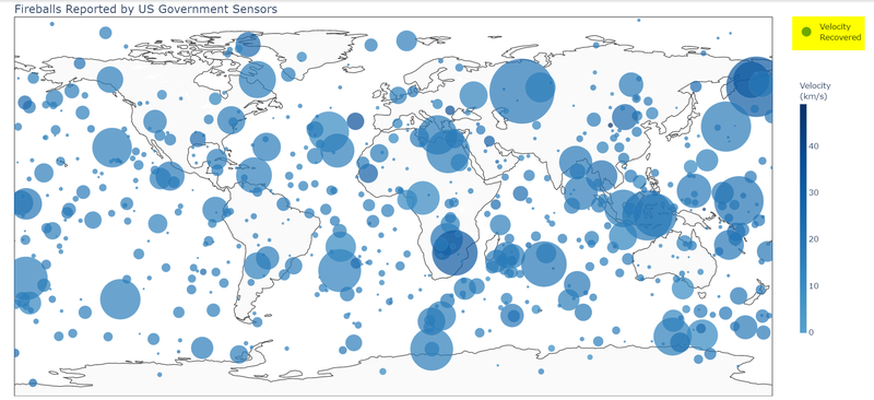
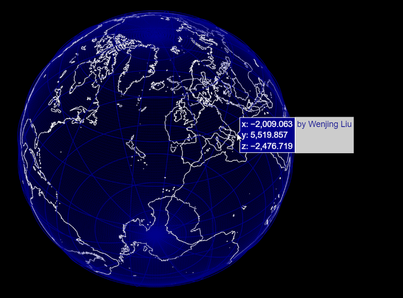
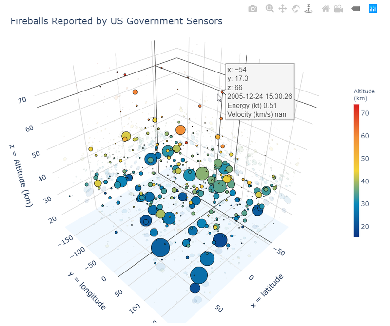
url1 = "https://raw.githubusercontent.com/Nov05/playground-fireball/master/data/Fireball_And_Bolide_Reports.csv"url2 = "https://raw.githubusercontent.com/Nov05/playground-fireball/master/data/cneos_fireball_data.csv"df = pd.read_csv(url2)# convert datetimedf['peak_brightness'] = pd.to_datetime(df.iloc[:,0], infer_datetime_format=True)df['year'] = df['peak_brightness'].dt.yeardf['month'] = df['peak_brightness'].dt.monthdf['hour'] = df['peak_brightness'].dt.hour# latitude and longitude # Degrees only formats (DDD + compass direction)"""41 N and 120 W41°N and 120°WN41.092 and W120.836290S and 0E (South Pole)"""df['latitude'] = df.iloc[:,1].apply(lambda x: 0 if x is np.nan else (float(x[:-1]) if x[-1]=='N' else float(x[:-1])*(-1)))df['longitude'] = df.iloc[:,2].apply(lambda x: 0 if x is np.nan else (float(x[:-1]) if x[-1]=='E' else float(x[:-1])*(-1)))df[['latitude', 'longitude']].sample(5)
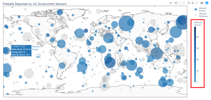
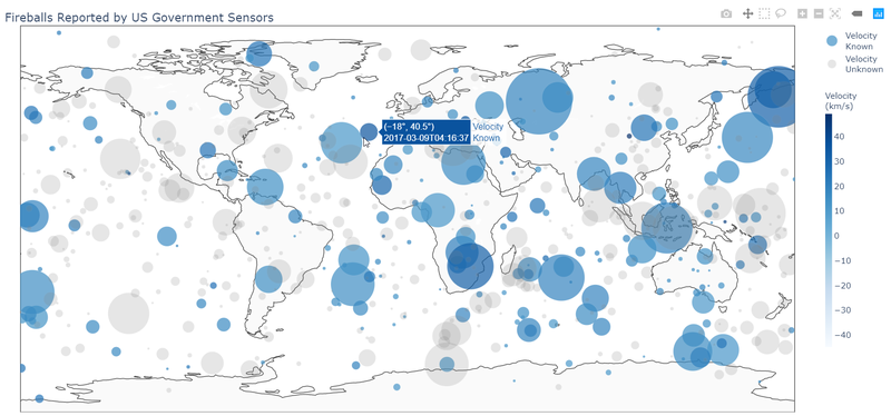
# Plotly 2D World Mapdf1 = df[(df['latitude']!=0) & (df['longitude']!=0)]df1['impact'] = np.log1p(np.log1p(df1['Calculated Total Impact Energy (kt)']))# scaler = MinMaxScaler()# df1['impact_norm'] = scaler.fit_transform(df1['impact'].values.reshape(-1,1))df1['impact_norm'] = df1['impact'] * 50df1['text'] = (df1['peak_brightness'].astype(str) + '<br>Energy (kt) ' + df1['Calculated Total Impact Energy (kt)'].astype(str) + '<br>Velocity (km/s) ' + df1['Velocity (km/s)'].astype(str))df2 = df1[df1['Velocity (km/s)'].isnull()==False]df3 = df1[df1['Velocity (km/s)'].isnull()==True]colorscales = ["Greens", "YlOrRd", "Bluered", "RdBu", "Reds", "Blues", "Picnic", "Rainbow", "Portland", "Jet", "Hot", "Blackbody", "Earth", "Electric", "Viridis", "Cividis"]color_rdbu = [ [0, 'rgb(12,51,131)'], [0.25, 'rgb(10,136,186)'], [0.5, 'rgb(242,211,56)'], [0.75, 'rgb(242,143,56)'], [1, 'rgb(217,30,30)']]color_blues = [ [0, 'rgb(5,10,172)'], [0.35, 'rgb(40,60,190)'], [0.5, 'rgb(70,100,245)'], [0.6, 'rgb(90,120,245)'], [0.7, 'rgb(106,137,247)'], [1, 'rgb(220,220,220)'] ]colorscale = 'Blues'# colorscale_rgb = [i[1] for i in colorscale]landcolor = "rgb(250, 250, 250)" #"rgb(212, 212, 212)"trace1 = go.Scattergeo( lon = df2['longitude'], lat = df2['latitude'], text = df2['text'], mode = 'markers', marker = dict( size = df2['impact_norm'], opacity = 0.7, autocolorscale = False, line = dict(width=0.1), color = df2['Velocity (km/s)'], colorscale = colorscale, cmin = -45, cmax = df2['Velocity (km/s)'].max(), colorbar_title = 'Velocity<br>(km/s)', colorbar = dict( x=1.01, len=0.7, thickness=10, outlinewidth=0), ), name='Velocity<br>Known', )trace2 = go.Scattergeo( lon = df3['longitude'], lat = df3['latitude'], text = df3['text'], mode = 'markers', marker = dict( size = df3['impact_norm'], opacity = 0.2, autocolorscale = False, line = dict(width=0.1), color = 'gray', ), name='Velocity<br>Unknown', )data = [trace1, trace2]layout = go.Layout( title=dict( text='Fireballs Reported by US Government Sensors', x=0.015, y=0.98), width=1300, height=600, margin=dict( l=0, r=0, b=0, t=30), geo = dict( landcolor=landcolor,), legend=dict(x=1.01),)fig = go.Figure(data=data, layout=layout)fig.show()